The team at WordPress is always working to enhance your writing and publishing experience, whether adding brand-new features or fixing bugs and minor inconveniences. The latest round of updates includes a feature you’ve long been asking for, a new block, and a few improvements to the general flow and convenience of publishing.
Let’s take a look!
Hide content with the new Details BlockThe new Details Block features a drop-down arrow that reveals hidden information when clicked. This block provides a way to hide content that some readers might not want or need to see — detailed event information, fine print notices, methodology or research notes, spoilers for books and movies, even the punchline to a joke. It’s basically a way for readers to opt-in to viewing some bit of content.

We’ve been using the Details Block internally at WordPress.com for ages, and we’re excited that it’s now been brought outside our digital office walls.
Source your work or add context with footnotesYou’ve been asking for footnotes, and we’re glad to let you know that this feature is now available in the editor!
To add a footnote:
- Click the small “More” arrow in the action bar that appears while editing a post/page, just to the right of the link icon.
- Select “Footnote” at the top.
- From there, your cursor will automatically move to the footnote for you to add a reference or comment.
In addition to the new Details Block and Footnotes function, we’ve made a few small improvements to the overall writing flow that will make your writing and editing a bit smoother.
“View post” button added
It used to take multiple clicks from the editor to view published posts or pages. This inconvenience has been remedied with a new button at the top of the editor. When you click it you’ll be taken to the published post/page in a new tab.
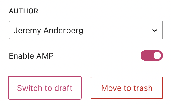
“Switch to draft” button moved
This button has been placed next to the “Move to trash” button on the right sidebar. When you click “Switch to draft,” a confirmation box will appear asking you if you’re sure about un-publishing the post/page.
“Preview” button enhancedThe preview button has been streamlined and enhanced so that the icon displayed matches the device you’re previewing. “Desktop” mode, the default, displays a laptop icon while “Tablet” and “Mobile” display those respective devices.
Are there other features that would your writing, editing, and publishing experience even better? Let us know in the comments!


