Facebook’s Focus On Mobile-Inspired Consistency Is All About Getting Facebook “Out Of The Way”

Today, VP of Product, Chris Cox discussed Facebook’s new-found focus on design consistency, something the company calls “mobile-inspired.” Today, with its News Feed and Photo redesign, you’ll notice consistency no matter what device you’re on. This hasn’t always been the case for Facebook. The idea of “desktop only” design seems to be dead, at least at Facebook HQ in Menlo Park. It’s all about mobile. What does that mean exactly? It means a more intimate experience, more responsive to touch and clicks, and way less clutter. “Now you can get to any page on Facebook to any other page on Facebook without going to your home page” said Cox. The best designers in the world say that to make people engage with a product, you have to make the “tech” disappear. That is of course done with beautiful and responsive design, and that’s the approach that Facebook is taking. One example of why Facebook had to take this approach is that Cox said 35% of Facebook users on the web never see the chat bar on the right hand side because of their browser width, so the company was missing out on a lot of message traffic because of that. The new responsive web design will fix that. These changes will roll out on the web today and then to mobile devices in the coming months. The roll out will be very slow, to make sure that the company gets incremental feedback. The rallying cry for the day at Facebook? “Goodbye Clutter.” Ads weren’t discussed at all, which is where I find that most of the clutter is. It will be interesting to see how advertisements evolve with this new design, and if we’ll see more of them. The definition of “clutter” is subjective, so we’ll see if Facebook’s definition will delight its over one billion users.

photo-2

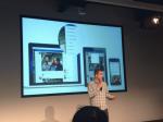
Today, VP of Product, Chris Cox discussed Facebook’s new-found focus on design consistency, something the company calls “mobile-inspired.” Today, with its News Feed and Photo redesign, you’ll notice consistency no matter what device you’re on. This hasn’t always been the case for Facebook.

The idea of “desktop only” design seems to be dead, at least at Facebook HQ in Menlo Park. It’s all about mobile. What does that mean exactly? It means a more intimate experience, more responsive to touch and clicks, and way less clutter.

“Now you can get to any page on Facebook to any other page on Facebook without going to your home page” said Cox. The best designers in the world say that to make people engage with a product, you have to make the “tech” disappear. That is of course done with beautiful and responsive design, and that’s the approach that Facebook is taking.

One example of why Facebook had to take this approach is that Cox said 35% of Facebook users on the web never see the chat bar on the right hand side because of their browser width, so the company was missing out on a lot of message traffic because of that. The new responsive web design will fix that.

These changes will roll out on the web today and then to mobile devices in the coming months. The roll out will be very slow, to make sure that the company gets incremental feedback.

The rallying cry for the day at Facebook? “Goodbye Clutter.”

Ads weren’t discussed at all, which is where I find that most of the clutter is. It will be interesting to see how advertisements evolve with this new design, and if we’ll see more of them. The definition of “clutter” is subjective, so we’ll see if Facebook’s definition will delight its over one billion users.


Data & News supplied by www.cloudquote.io
Stock quotes supplied by Barchart
Quotes delayed at least 20 minutes.
By accessing this page, you agree to the following
Privacy Policy and Terms and Conditions.