


At WordPress.com, our goal is to provide the best tools for WordPress developers and agencies.
We built Studio for that reason. Our free local WordPress development environment launched a few months ago; it’s based on Electron and is currently available for Mac and Windows. Plus, we have big exciting updates coming for Studio users soon.
Download Studio for freeOne of the unique things about Studio is that it’s an open source tool, and it has been since day one. This directly aligns with the Automattic Creed, the driving force behind what we do at WordPress.com (and all of our other Automattic brands):
I know that Open Source is one of the most powerful ideas of our generation.
For this reason, we love building in public. In our new Building Studio in Public series, we want to share some of the learnings and insights we gained from building Studio, and our hope is that some of the lessons can help you build better products.
If you want more in-depth articles about why we chose Electron, why this is an open source project, or any other question you have about Studio, leave a comment below, and we’ll make it happen.
First up in this series, we’ll explore how we decided to use Tailwind CSS to style the WordPress components that make up Studio and why that decision gave us extra flexibility for the future of Studio.
WordPress components everywhere
Components allow developers to create reusable pieces of code that can be composed together to build complex user interfaces. They encourage a modular and declarative approach of building UIs, where each component is responsible for a single piece of functionality or user interface element.
WordPress components are a great example of that. These components allow core and extender developers to create organized, separate, and interconnected parts of the WordPress admin interface. Not only do components make development easier and more streamlined, but they are also predictable and familiar across all WordPress users.
Do not confuse WordPress components with Gutenberg Blocks. While the latter are used to build WordPress frontend websites, the former are designed for building the admin interface of the WordPress site editor. They are React-based, making them versatile and applicable in any WordPress plugin or theme admin interface. They also come in handy for building different apps beyond WordPress; the only requirement is that the project uses React.
WordPress components offer a consistent style and behavior that match the WordPress admin interface out of the box, so using them in other projects outside of the WordPress ecosystem gives a familiar look and feel to the interface and user experience.
Not only that, the components are accessible and receive constant updates and improvements. They are implemented in JavaScript as React components, which means they can be integrated into any project. Plus, by using WordPress components in Studio, developers can more easily contribute back to this open source project because Studio is using a technology they’re already used to.
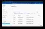
To quickly find the right component and experiment with them, you can use the WordPress Storybook, an open source tool for developing system designs and creating components in isolation. Storybook even gives you sneak peeks and allows you to interact with new components like DataViews, a component intended for future use in managing lists of posts, pages, and media uploads.
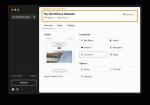
 Components in Studio
By integrating WordPress components into Studio, we ensure a familiar user experience for WordPress users––you’re building WordPress with a tool that looks and feels like WordPress.
Most buttons, dropdowns, and menus will be familiar to WordPress users, and because Studio is an open source tool, anyone with Gutenberg experience will find it much easier to understand Studio’s code and contribute if they are interested.
If you’re developing a different application, you might want to adapt the WordPress component styles to fit your design. In the case of Studio, we’ve utilized Tailwind CSS for this purpose.
Tailwind CSS is a popular, utility-first CSS framework that we use to customize the styles of WordPress components using only CSS classes.
Utilizing the power of WordPress components and Tailwind CSS future-proofs the Studio app; it’s easy to reuse these components for new features and app updates because they’re already imported into the project in a style that suits the app.
If a screen needs a new button, we already have loads of Studio-styled buttons to choose from; we don’t need to design from scratch each time a new button is needed.
Here’s how we used WordPress components and Tailwind CSS to build Studio (and how you can use them for your own projects, too):
Step 1: Set up Tailwind CSS and install WordPress componentsAfter setting up Tailwind in your project, you’ll need to install WordPress components. Simply run the following command:
npm install @wordpress/components –saveStep 2: Import WordPress component styles
You’ll need to import WordPress component styles to inject the CSS that is built into the components by default. This speeds up the process of building your project’s interface.
In your main CSS file, import the Gutenberg component styles:
@import '@wordpress/components/build-style/style.css';Step 3: Customize Components with Tailwind CSS
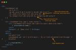
Use the className property to apply Tailwind CSS styles. Sometimes, the ! modifier is needed to mark the style as important and override existing WordPress styles.
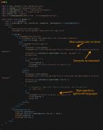
Take Studio’s Header component, for example:

We’re using:
- @wordpress/react-i18n for translations.
- @wordpress/icons to display the icons.
- The default from @wordpress/components with our own additional styling to ensure that all of Studio’s buttons are consistent with one another.
To use Tailwind CSS in WordPress components, you need to pass in the utility classes to style the elements into the className React prop. Sometimes you’ll need to force an overwrite to the existing WordPress styles, and that’s where you can use the exclamation mark (!).
 Step 4: Accessing nested elements for use across your project
With Tailwind CSS, you can use sophisticated selectors to target user interactions and nested elements within a component. This will allow you to dynamically change stylings across your project based on user and app behavior.
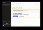
For example, in Studio’s Demo Sites area, we change the style of the nested element’s site name and badge to a grey color when the demo site expires.

To dynamically style this component, we use [&_.badge]:text-red, where & means current element and _ means any child element. You can apply specific styles to a direct child element by using the greater-than operator, like this: [&>div]:text-red.
 Ready to build?
By leveraging WordPress components and customizing them with Tailwind CSS, you can significantly enhance your development process, providing a seamless and professional user experience.
This decision allowed us to create an app that looks and feels like the WordPress interface in a way that benefits users and speeds up our development time. That’s a win-win, in my book.
If you’re building WordPress sites, start developing your WordPress sites locally with the power of Studio today. It’s free, it’s open source, and it will effortlessly fit into your development workflow.
Download Studio for freeOnce you download Studio: Be sure to connect Studio to your WordPress.com account (free or paid) to access features like Demo Sites.
And if you want to help us build Studio, here are some GitHub issues that you can contribute to right away:
