Kobo’s Elipsa is the latest in the Amazon rival’s e-reading line, and it’s a big one. The 10.3-inch e-paper display brings it up to iPad dimensions and puts it in direct competition with the reMarkable and Boox’s e-reader tablets. It excels on reading experience, gets by on note-taking and drawing, but falls a bit short on versatility.
Kobo has been creeping upmarket for a few years now, and though the cheaper Clara HD is still the pick of the litter in my opinion, the Forma and Libra H2O are worthy competitors to the Kindle lines. The $400 Elipsa represents a big step up in size, function, and price, and it does justify itself — though there are a few important caveats.
The device is well designed but lacks any flourishes. The tilted “side chin” of the Forma and Libra is flattened out into a simple wide bezel on the right side. The lopsided appearance doesn’t bother me much, and much of the competition has it as well. (Though my favorite is Boox’s ultra-compact, flush-fronted Poke 3)
The 10.3″ screen has a resolution of 1404 x 1872, giving it 227 pixels per inch. That’s well below the 300 PPI of the Clara and Forma, and the typography suffers from noticeably more aliasing if you look closely. Of course, you won’t be looking that closely, since as a larger device you’ll probably be giving the Elipsa a bit more distance and perhaps using a larger type size. I found it perfectly comfortable to read on — 227 PPI isn’t bad, just not the best.
There is a frontlight, which is easily adjustable by sliding your finger up and down the left side of the screen, but unlike other Kobo devices there is no way to change the color temperature. I’ve been spoiled by other devices and now the default cool grey I lived with for years doesn’t feel right, especially with a warmer light shining on your surroundings. The important part is that it is consistent across the full display and adjustable down to a faint glow, something my eyes have thanked me for many times.
Image Credits: Devin Coldewey / TechCrunch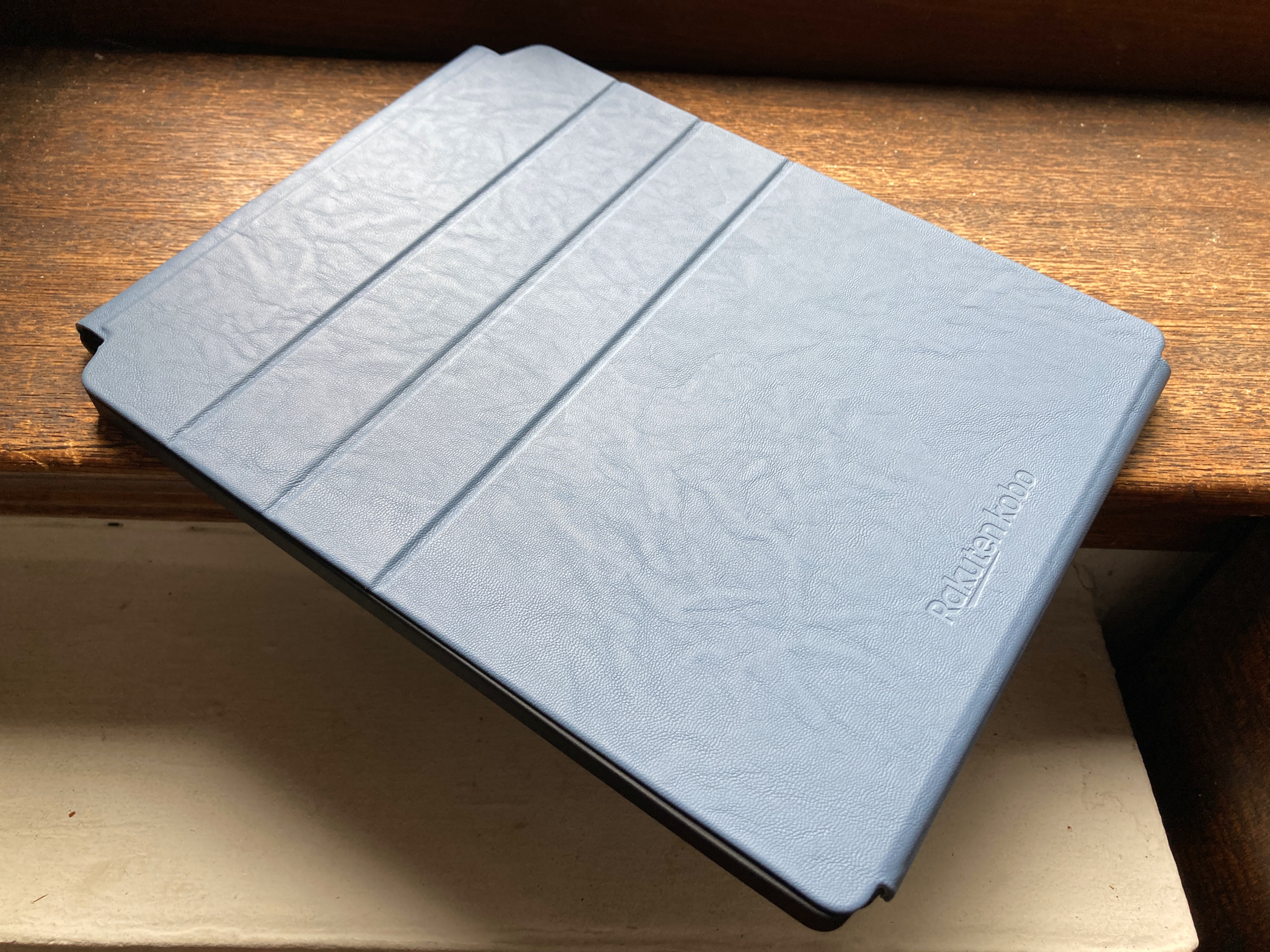
It’s hard to consider the Elipsa independent from the accessories it’s bundled with, and in fact there’s no way to buy one right now without the “sleep cover” and stylus. The truth is they really complete the package, though they do add considerably to its weight and bulk. What when naked is lighter and feels smaller than a standard iPad is heavier and larger once you put its case on and stash the surprisingly weighty stylus at the top.
Image Credits: Devin Coldewey / TechCrunch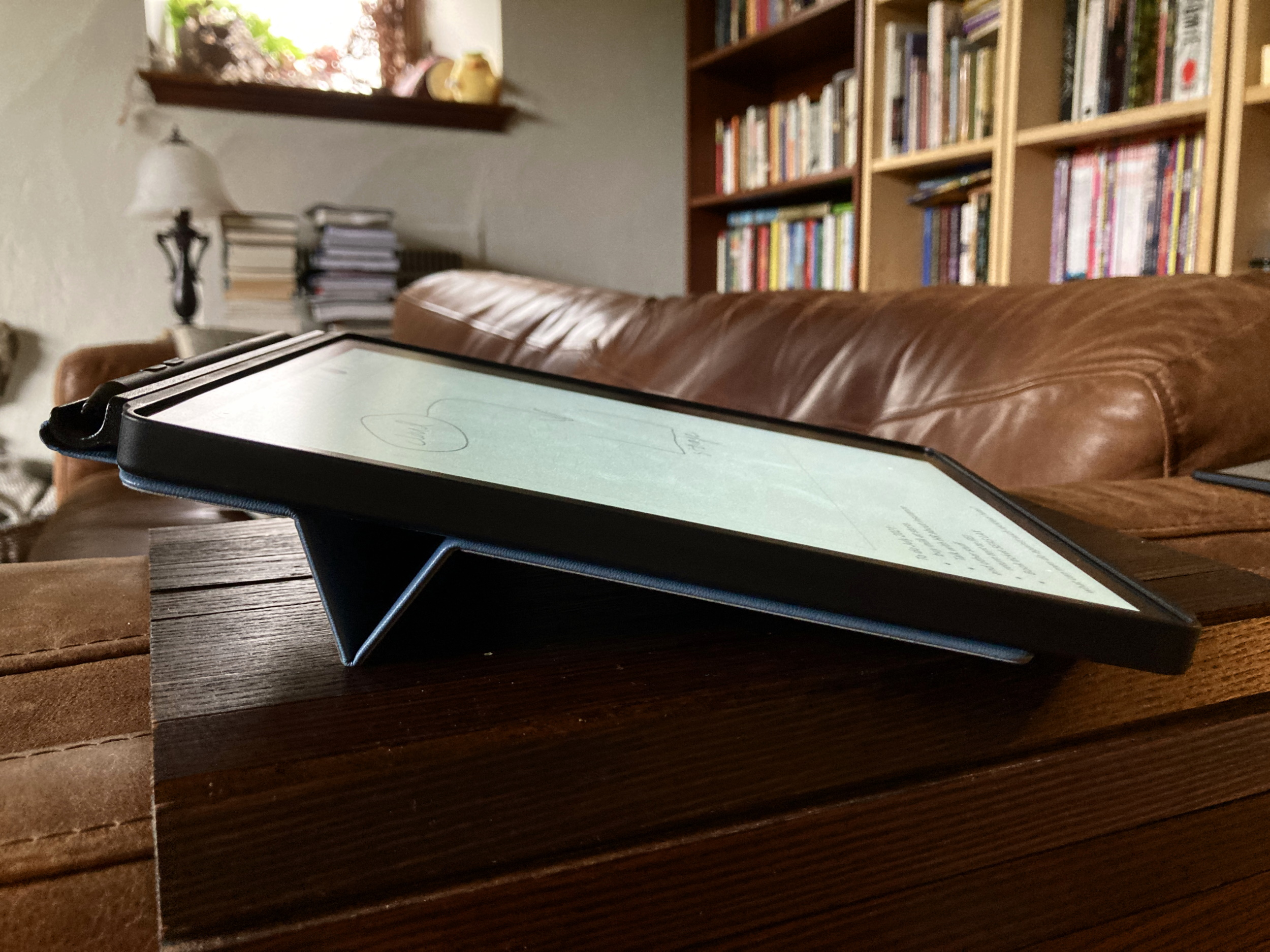
The cover is nicely designed, if a bit stiff, and will definitely protect your device from harm. The cover, secured by magnets at the bottom, flips off like a sheet on a legal pad and folds flat behind the device, attaching itself with the same magnets from the other direction. A couple folds in it also stiffen up with further magnetic arrangement into a nice, sturdy little stand. The outside is a grippy faux leather and the inside is soft microfiber.
You can wake and turn off the device by opening and closing the cover, but the whole thing comes with a small catch: you have to have the power button, charging port, and big bezel on the right. When out of its case the Elipsa can, like the others of its lopsided type, be inverted and your content instantly flips. But once you put it in the case, you’re locked in to a semi-right-handed mode. This may or may not bother people but it’s worth mentioning.
The Elipsa, center, with the Forma and reMarkable 2 to its left and right.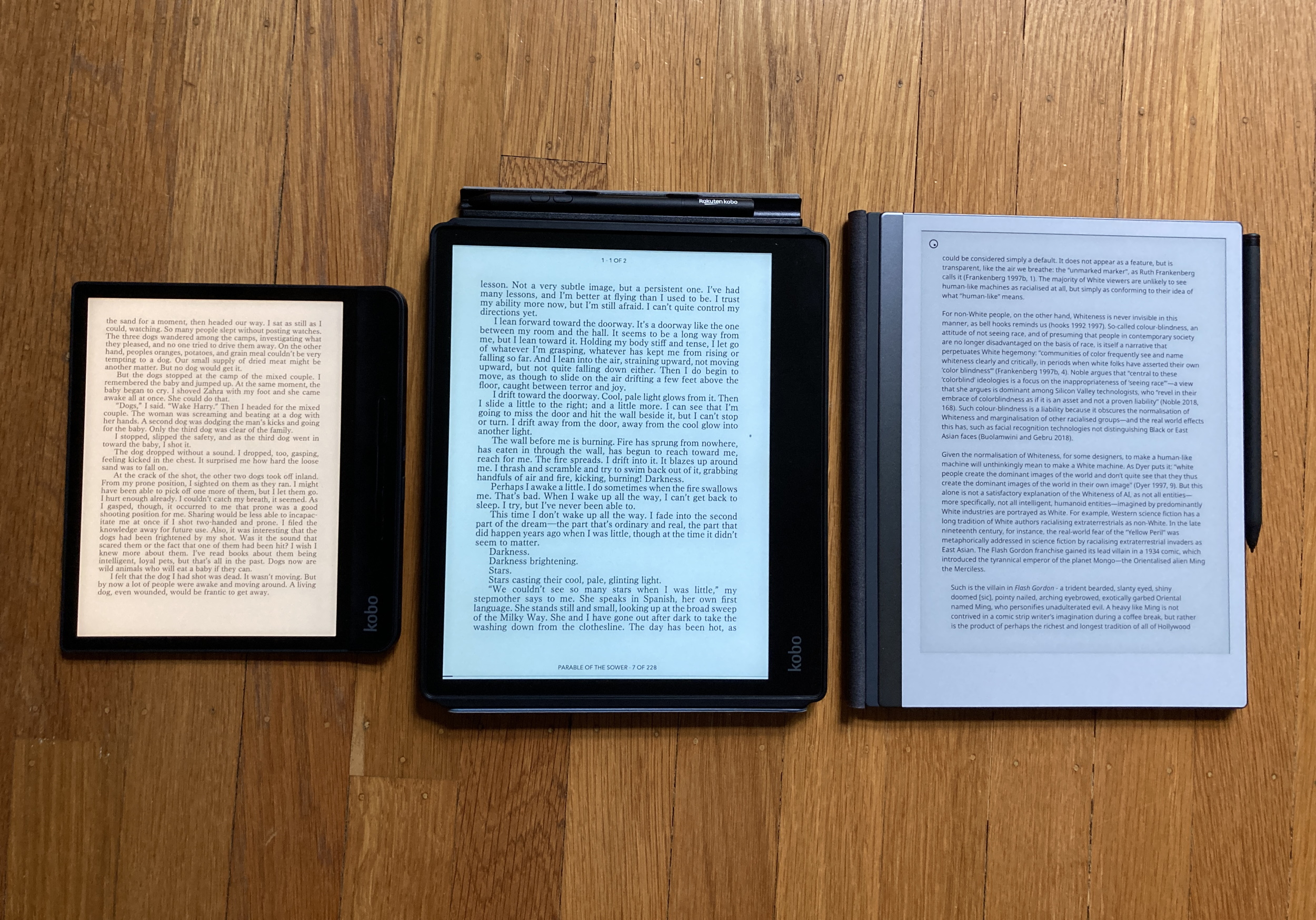
The reading experience is otherwise very similar to that on Kobo’s other devices. A relatively clean interface that surfaces your most recently accessed content and a not overwhelming but still unwelcome amount of promotional stuff (“Find your next great read”). Ebooks free and paid for display well, though it’s never been my preference to read on a large screen like this. I truly wish one of these large e-readers would make a landscape mode with facing pages. Isn’t that more booklike?
Articles from the web, synced via Pocket, look great and are a pleasure to read in this format. It feels more like a magazine page, which is great when you’re reading an online version of one. It’s simply, foolproof and well integrated.
Kobo’s new note-taking prowessWhat’s new on the bottom row, though, is “Notebooks,” where unsurprisingly you can create notebooks for scribbling down lists, doodles, notes of course, and generally use the stylus.
The writing experience is adequate. Here I am spoiled by the reMarkable 2, which boasts extremely low lag and high accuracy, as well as much more expression in the line. Kobo doesn’t approach that, and the writing experience is fairly basic, with a noticeable amount of lag, but admirable accuracy.
There are five pen tips, five line widths, and five line shades, and they’re all fine. The stylus has a nice heft to it, though I’d like a grippier material. Two buttons on it let you quickly switch from the current pen style to a highlighter or eraser, where you have stroke-deleting or brush modes. The normal notebooks have the usual gridded, dotted, lined and blank styles, and unlimited pages, but you can’t zoom in or out (not so good for artists).
Then there are the “advanced” notebooks, which you must use if you want handwriting recognition and other features. These have indelible lines on which you can write, and a double tap captures your words into type very quickly. You can also put in drawings and equations in their own sections.
Close enough. Image Credits: Devin Coldewey / TechCrunch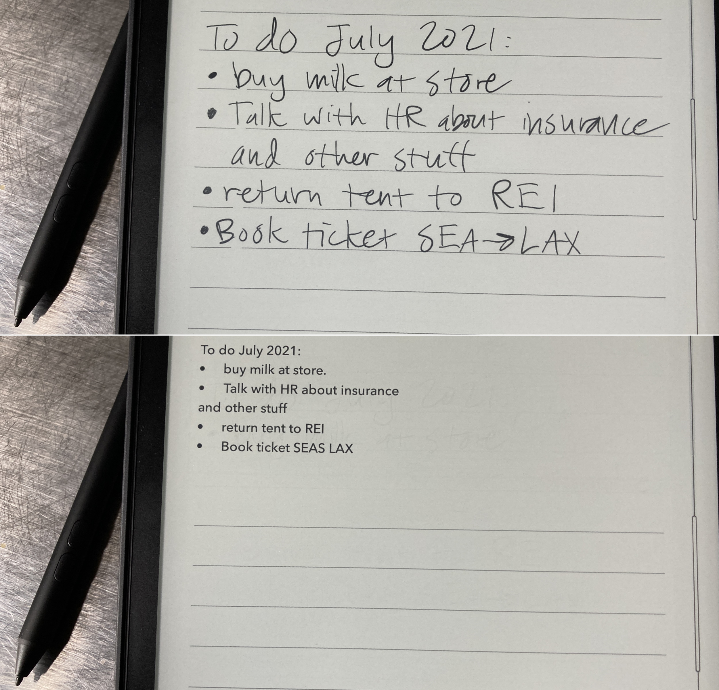
The handwriting recognition is fast and good enough for rough notes, but don’t expect to send these directly to your team without any editing. Likewise the diagram tool that turns gestural sketches of shapes and labels into finalized flowcharts and the like — better than the original wobbly art but still a rough draft. There are a few clever shortcuts and gestures to add or subtract spaces and other common tasks, something you’ll probably get used to fairly quick if you use the Elipsa regularly.
The notebook interface is snappy enough going from page to page or up and down on the “smart” notebooks but nothing like the fluidity of a design program or an art-focused one on an iPad. But it’s also unobtrusive, has good palm blocking, and feels nice in action. The lag on the line is definitely a con, but something you can get used to if you don’t mind the resulting product being a little sloppy.
Image Credits: Devin Coldewey / TechCrunch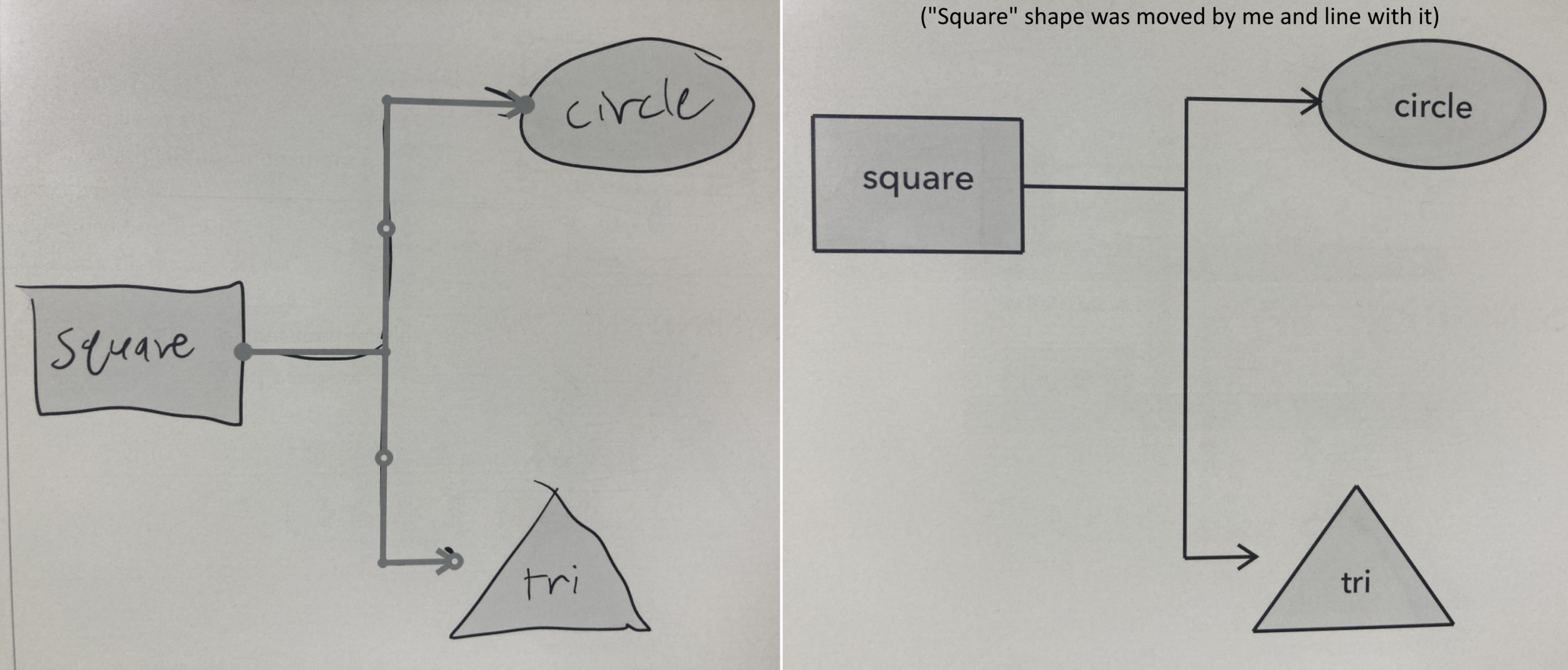
You can also mark up ebooks, which is nice for highlights but ultimately not that much better than simply selecting the text. And there’s no way you’re writing in the margins with the limitations of this stylus.
Exporting notepads can be done via a linked Dropbox account or over USB connection. Again the reMarkable has a leg up here, for even if its app is a bit restrictive, the live syncing means you don’t ever have to worry about what version of what is where, as long as it’s in the system. On the Kobo it’s more traditional.
Compared to the reMarkable, the Kobo is really just an easier platform for everyday reading, so if you’re looking for a device that focuses on that and has the option of doodling or note-taking on the side, it’s a much better deal. On the other hand, those just looking for an improvement to that stylus-focused tablet should look elsewhere — writing and sketching still feels way better on a reMarkable than almost anything on the market. And compared with something like a Boox tablet, the Elipsa is more simple and focused, but doesn’t allow the opportunity of adding Android apps and games.
At $400 — though this includes a case and stylus — the Elipsa is a considerable investment and comparably priced to an iPad, which is certainly a more versatile device. But I don’t particularly enjoy reading articles or books on my iPad, and the simplicity of an e-reader in general helps me focus when I’m making notes on a paper or something. It’s a different device for a different purpose, but not for everyone.
It is however probably the best way right now to step into the shallow end of the “big e-reader” pool, with more complex or expensive options available should you desire them.