


You know, for all the changes HTC has made to its Sense interface for smartphones over the years, it generally looks the same as it did back in the old days. That may not be the case for much longer if a new batch of screenshots spotted on the xda-developer forums are to be believed — they claim to provide an even better look at HTC’s forthcoming Sense 5 interface, and (if real) they represent a big step forward for HTC’s custom UI.
Before we go any further, I just have to point out that the kicker here is where the images came from — according to a thread on the xda-developer forums, someone managed to flash a Sense 5-laden build of Android 4.1.2 onto a Verizon Droid DNA. And where did that ROM come from? Well, should you believe the original post, it came from a Sprint-branded HTC M7 (you know, the not-so-secret flagship that HTC hasn’t officially announced yet).
It sounds sketchy, I know, but the visual style seen in these images matches the one seen in a batch of leaked photos that purportedly depict the M7 itself. As always, I’d advise you to have your grains of salt at the ready.
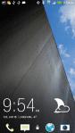
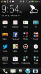
First impressions? If all of this is legitimate, HTC really may be onto something. It’s a pretty drastic leap from the Sense overlays of yore, which have generally looked very similar (save for some recent, much-needed changes) for years now. There are plenty of little touches that seem to bring the overall Sense experience closer to the cold, digital aesthetic that Google had in mind for Ice Cream Sandwich and Jelly Bean, and that’s just fine by me. Perhaps one of the biggest tweaks here is to Sense’s typography — the skin’s usual font has been replaced with a narrower typeface (Engadget referred to it as a sort of “Roboto condensed”) which helps things feel less cluttered.
Interestingly, the icons for the stock dialer, web browser, messaging, and camera apps all seem flatter and less skeuomorphic than the ones seen in earlier versions of Sense. The word that keeps popping into my head is “sparse” — the visual quiet of the phone app and the app launcher is a curious change, but one I hope pans out and pervades the rest of the company’s custom UI. Then again, your mileage may vary on that: I prefer Google’s minimalism, but Samsung sells a crazy number of TouchWizzed devices so someone clearly enjoys garish, overwrought interfaces.
