If one of your 2024 goals is to take your career to the next level, it’s worth taking a hard look at your resume. In a world where bots are scanning resumes for keywords, doing something unique—like creating a website just for your resume—is perhaps risky, but can help you stand out from the pack. And even if you aren’t actively looking for a new workplace, having a resume-focused site is great for your personal brand.
Today, we’re going to show you how to use (nearly) any WordPress.com theme to create a stellar resume website.
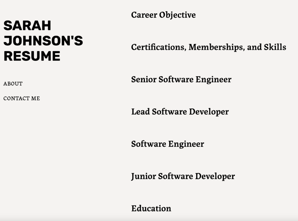 An example using the Bibliophile theme. 1. Choose a theme.
 For the purposes of your resume site, think less about the structure of the theme and more about the overall aesthetics. Whether you’re going for fun and retro or more buttoned-up, think about your industry and what represents you most clearly. As you’re scrolling through our showcase, pay attention to any theme that stands out before you even really think about it—the one that makes you say, “Ooh, that one is cool.”
2. Publish your resume items as posts.
Once you select a theme, start adding content. Turn each section of your resume into its own post:
- Career objective and personal statement
- Education
- Work experience #1
- Work experience #2
- Work experience #3
- Certifications, memberships, and additional skills
Depending on the theme, it may make sense to publish them in a specific order that reads the best on a visual level. For example, put your career objective at the top, then your most recent work experience, etc. You can also edit publish dates to move things around in the way that fits best with the theme you choose.
3. Add pagesIn addition to utilizing posts that list out your resume items, you should also include at least two pages:
- About
- Contact
On the “About” page, feel free to tell your story in a slightly more casual way—while still maintaining an appropriate level of professionalism for your industry. On the “Contact” page, you can either use our built-in Contact Form block or simply provide your email address. (We don’t recommend putting your phone number directly on your site.)
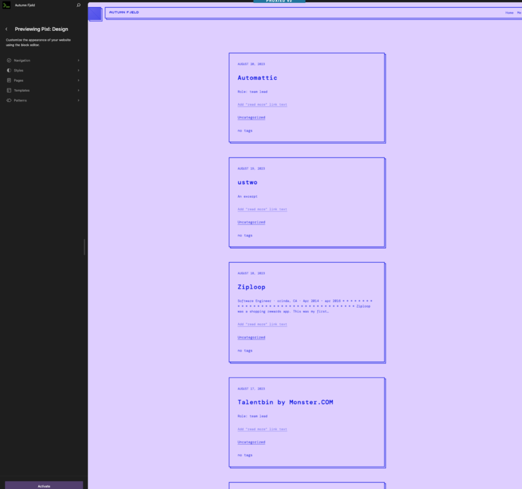 If you hit the “Preview & Customize” button on any theme page, you’ll be brought to our site preview feature, which shows your site using that theme. Try it out! This is an example with the Pixl theme.
 You might also want to add additional pages, depending on your career.
- If you’re a writer or artist, including a “Portfolio” or “Work Examples” page is a good idea.
- For a software engineer, a showcase of projects or code snippets you worked on may be a valuable addition.
- If you have LinkedIn recommendations or other testimonials of your work, a “Testimonials” page may be in order.
Finally, no matter your field, pages like “Hobbies” or “Volunteering” can add some personal flavor and show prospective employers that you’re more than just an automaton.
4. Ship it, and update as needed!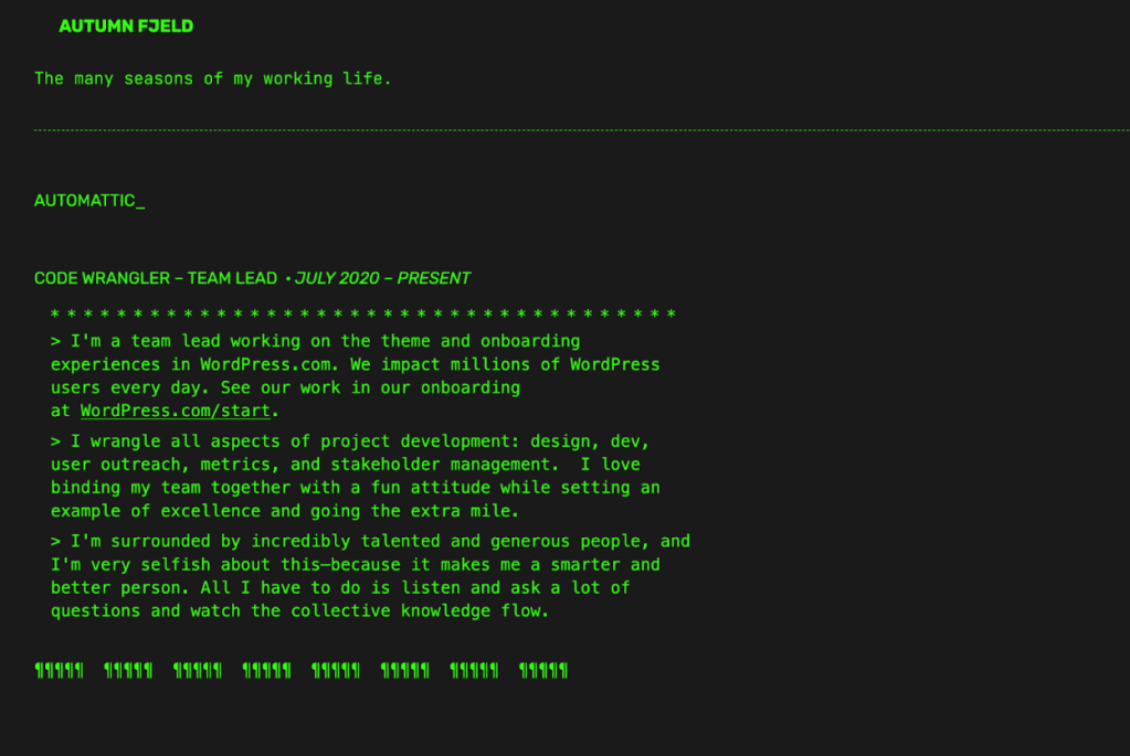 This is an example using the fun and nostalgic Dos theme.
Once your posts and pages are published, share your site with the world! Or, as we say around here: ship it. Share your shiny new site on social media, include the URL in any doc/PDF resumes you send out (cover letters, too), and add it to your email signature.
Whether you’re searching for a job or not, be sure to actively update your site with any new jobs, roles, achievements, etc.
Get started


