LA Kings Unveil Brand Evolution
New Core Elements Connect Club History Under the Theme “Legacy Moves Us Forward”
New Jerseys to Be Unveiled Next Week
The LA Kings today officially announced and unveiled a brand evolution consisting of new team logos and design elements. Specifically, the team's new primary mark, which contains core elements from the club’s 90s era and original crown from the team’s inception in 1967. Additionally, the club introduced new word marks, brand font and updated color palette, which features a new “enhanced silver,” which will be showcased on the club’s new jerseys that will be introduced next week. All marks go into effect immediately.
This press release features multimedia. View the full release here: https://www.businesswire.com/news/home/20240620174519/en/
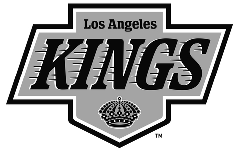
The new logo is a reimagined version of the iconic logo the Kings featured from 1988-1998 and now features an updated version of the original “Kings Crown” from their inaugural season in Los Angeles. The official team colors remain Black, Silver, and White.
As part of the announcement, the Kings released the club’s official launch video, brand assets, and special podcast which highlights the visuals of the rebrand. The organization feels the new branding reflects the club’s strong legacy and is a recognized pillar brand that helps carry the hockey club into its long-term future.
“This has been an extensive and collaborative process, and we are thrilled to roll this out to our fans and the city of Los Angeles,” said Kings President and Hockey Hall of Famer Luc Robitaille. “This evolution is rooted in our 57-year history and embraces the elements of our eras. It also involved interface and feedback with players both past and present, and it sets the stage for extensions and new iterations in the future.”
Said Kings Chief Operating Officer Kelly Cheeseman: “We are incredibly excited to unveil our new design elements as we believe it represents the very best of the LA Kings. From ownership to our players, our organization is proud to usher in a new era of LA Kings Hockey. We are excited for our fans to be part of this with us.”
Fans can purchase merchandise in-person for the first time at the Team LA Store at Crypto.com Arena which will be open this weekend to exclusively sell new Kings merchandise. On Friday, from 11 a.m.-2 p.m., members of the Kings alumni and broadcast team will be at a special celebratory event, as will Bailey, our DJ, and in-arena hosts and LA Kings Ice Crew members. Team LA store hours will be Friday (11-5), and Saturday (10-6) and Sunday (10-6).
Two years in the making in terms of development, the reveal of the Kings brand evolution is highlighted by the team’s new primary logo. The new primary mark for the Kings draws inspiration from the classic 1988 logo – which debuted in 1988 at the same time the Kings acquired Wayne Gretzky – yet incorporates subtle differences that modernize the design.
Meticulously hand-drawn, this logo reflects elements from all eras of Kings hockey. The overall shape has been expanded by widening the vertical section, providing space for a larger “LOS ANGELES” text and a more prominent crown. This increased width also mirrors the most previous logo shape.
Additionally, the horizontal portion has been heightened, allowing room for the centerpiece: The heavier-weighted “KINGS” text with speedlines. The font is thicker and slightly less italicized. While the number of speedlines has been reduced, their thickness has increased, and each speedline is unique in length and shape. The white drop shadow on the “KINGS” text now falls on the left side, enhancing the sense of movement from left to right, and the font for the words “LOS ANGELES” and “KINGS” were changed to increase legibility.
As part of today’s announcement, the Kings officially “retire” the team’s most recent primary logo, which made its debut in 2008 as the featured element of an alternate jersey. The team soon thereafter adopted the logo as its primary mark, and the Kings captured both of their Stanley Cups wearing the black version of that jersey.
The Kings have worn various versions of the 1988-1998 jersey in recent years, including the past three seasons in what the club referred to as the 90s Era Heritage Jersey.
– LAKINGS.COM –
View source version on businesswire.com: https://www.businesswire.com/news/home/20240620174519/en/
Contacts
Jeff Moeller – Senior Director, Business Communications and Heritage | (310) 535-4544 | jmoeller@lakings.com
If you believe this article contains misleading, harmful, or spam content, please let us know.
Report this articleMore News
View More


Recent Quotes
View MoreQuotes delayed at least 20 minutes.
By accessing this page, you agree to the Privacy Policy and Terms Of Service.