One of the most exciting things about WordPress is that it’s constantly improving. In fact, did you know that Gutenberg releases new functionality and improvements every two weeks?! There have been a number of really cool and powerful capabilities rolled out over the last few months that give you even more control over the design of your site and your content. We wanted to take a minute to highlight some that we’re especially excited about.
Note: These updates are most relevant to those of you who have a block theme activated.
- Use Your Featured Image in the Cover Block
- Patterns Are Easier to Find and More Convenient to Use
- Borders in Layout Blocks
- See What Margin vs Padding Actually Does
- Patterns Are Easier to Find and More Convenient to Use
- Leveling Up the Query Block
- Notable Mentions

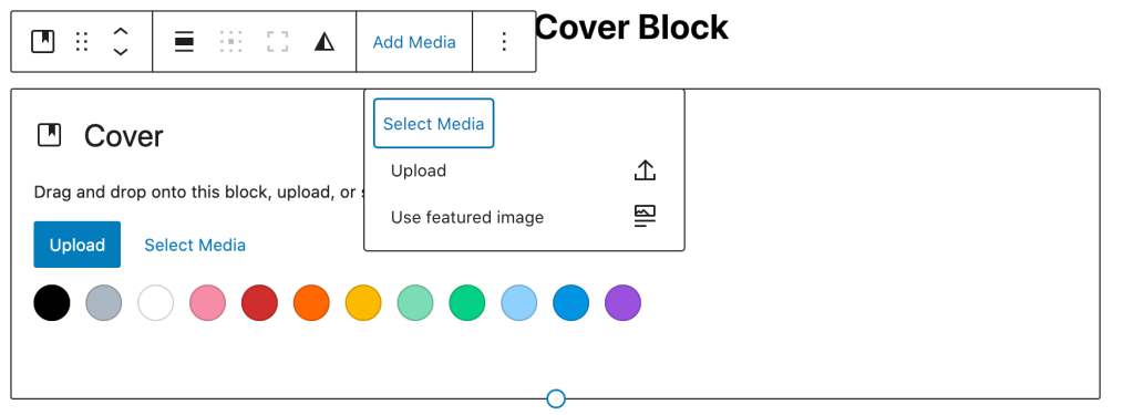
Over the last few months the Gutenberg team has really powered up the cover block and its ability to leverage the featured image set in your post/page. Not only can you do that when creating new content, you can use it in your templates too, making it easier than ever to make your featured image a bigger part of every post.
Patterns Are Easier to Find and More Convenient to UseGutenberg 12.7 brings patterns front and center to help save you time and energy. Why recreate a layout block by block when you can start with something more complete? Take advantage of all of the great patterns the WordPress.com designers put together for our customers or maybe consider adding a pattern of your own to the WordPress.org pattern directory.
Borders in Layout Blocks
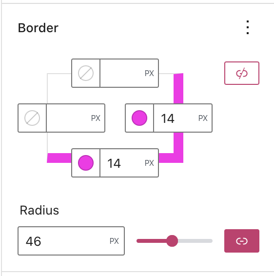
You now have the ability to add and customize borders in the columns, row, stack, and group blocks. Use them for subtle dividers or go nuts to create some fun retro drop-shadows. This is a great way to make different sections on your site stand out!
See What Margin vs Padding Actually DoesI’ve been working in the web space for a long time and I still get confused with how padding and margin will impact my layout — especially when there are multiple layers of blocks involved! You will now see exactly where the change is being applied as you adjust your settings.
Patterns Are Easier to Find and More Convenient to Use
Gutenberg 12.7 brings patterns front and center to help save you time and energy. Why recreate a layout block by block when you can start with something more complete? Take advantage of all of the great patterns the WordPress.com designers put together for our customers or maybe consider adding a pattern of your own to the WordPress.org pattern directory.
Leveling Up the Query BlockThe Query Loop has grown a lot over the past few months. Not only can you filter by different authors or taxonomies, but you can now filter to show all content under a parent category. This is perfect for creators who create different types of content or jump between drastically different subject matters. It’s really the ultimate block for displaying a collection of posts and it just keeps getting better.
Notable Mentions
- You can now customize and display text on your social icons.
- We’ve made it easier to transform your content into different blocks without losing the work you’ve already done.
- Your new buttons will keep the design settings you already applied, preventing you from having to re-apply the settings for every button you add.
This is just a small subset of new features released over the last few months. Let us know what you think in the comments and feel free to share your favorites!


