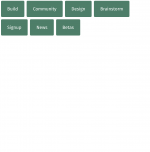
This month, our team released features in the block editor that give your site a little breathing room: spacing controls for buttons and paragraphs. And the List View tool keeps getting better with drag-and-drop.
Powerful Expanded Button FormattingButtons never looked so good with custom padding.
Padding is empty space within the border of a block, which can bring clarity to your content and adjust the balance of the page’s layout.
Custom control over a button’s spacing, color, and aggressiveness of the corner radii — all within the visual editor — can elevate it as a powerful design element of your website.
Make a punchy set of buttons themed in your brand’s colors or place an effective Call to Action button to attract your visitors.
To try, add a button with the Buttons block, and in the block’s menu go to the Dimensions section and select Padding. Adjust the padding uniformly around the button by changing the one value. If you click the unlink icon, you can adjust the four sides independently. Experiment with changing the Border and Color as well. To quickly create a grid of similar buttons, select the Options icon (…) in the toolbar above the block in your post editor and select Duplicate.
Manually adjust the padding of other blocks as well, like a Paragraph block.
Custom-indent an entire section of text or generously pad a small amount of text for a big effect.
Experiment by wrapping a couple paragraphs with a Group block. Select the Group block and in the block’s menu go to the Dimensions section and select Padding. You can adjust the padding in this block just as you did with the button.
We mentioned updates to the List View in June and July.
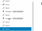
Accessible in the top-left menu of your post editor, the List View is the table of contents of all the blocks used in your post — select the diagonal hamburger icon to open this list. For deeply nested layouts, you can expand and collapse certain sections of this list, making navigation more efficient.
Now, with drag-and-drop functionality, you can reposition blocks within your post. Drag-and-drop a block within the list to reposition it, but if you prefer to organize visually, you can also drag the block’s label from the list into the post editor. List View is more powerful than ever to reorganize a post.
Your feedback is crucial to expanding the block editor’s capabilities, so keep it coming. Watch here for more updates, and in the meantime, go forth and create!


