

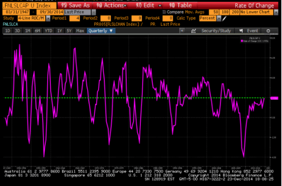
The above chart is real final demand. Finally back to long term average.
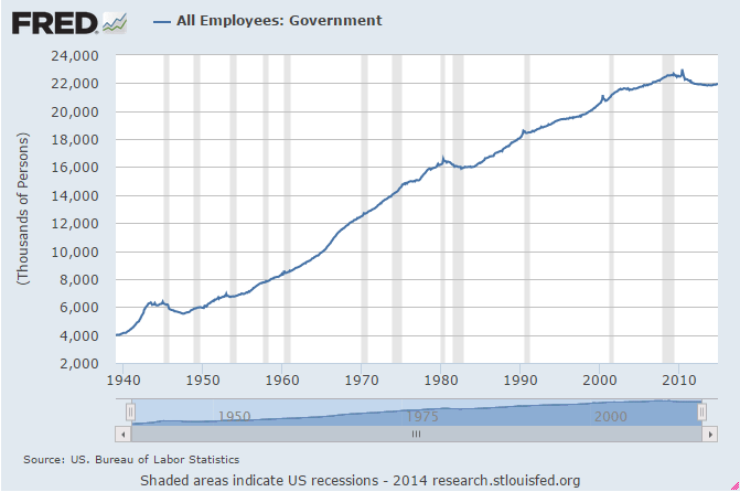
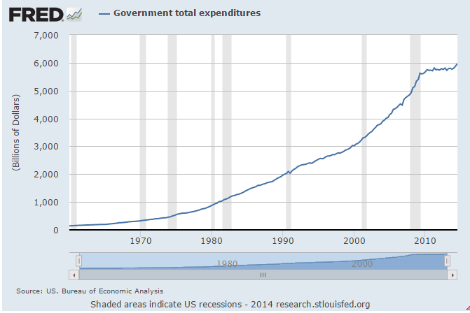
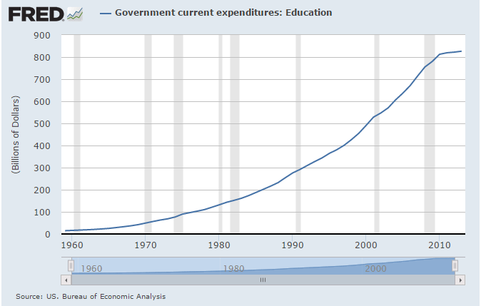
A few charts below that show what’s happened to govt under Obama.
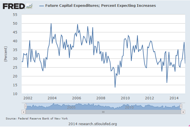
A capex related charts not looking so good.
And the auto industry has a bit of inventory to work off.

The above chart is real final demand. Finally back to long term average.
A few charts below that show what’s happened to govt under Obama.
A capex related charts not looking so good.
And the auto industry has a bit of inventory to work off.
