The times have changed, and many in our society have no idea how much. The FOMC increased interest rates at an historic pace over the past 18 months, and it will be years before the impacts have run their course. Economists estimate up to 2 years for a single rate hike to run its course, which means the first hike, announced in the spring of 2022, is still working its magic.
Mortgage rates are among the many signs that a “new normal” exists. The average rate on a 30-year mortgage is above 7.5% and at a level keeping existing home sellers out of the market.
At 7.5%, average mortgage rates are 200 basis points above what some consider the trigger point to unlock the housing market and broad economy, and it will be a while before that point is reached again. Based on the data, the FOMC will likely increase interest rates before they lower them, and their policy is impacting more than the housing market.
Here are 5 charts highlighting the new normal that may alter your outlook on what, where, and how to invest over the next few years.
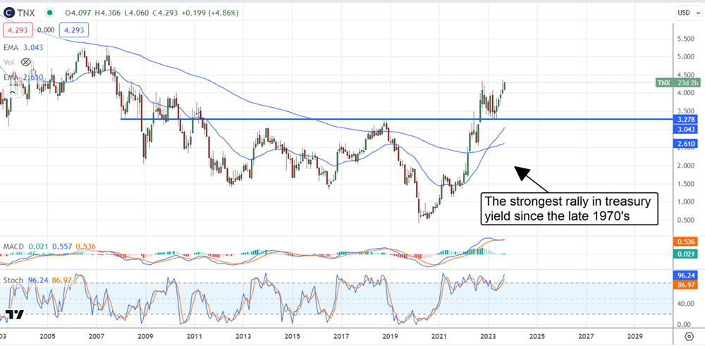
The 10-Year Treasury is a Barometer of the Economy
The 10-year treasury rate has risen over the last 18 months with the FOMC base rate. The yield on the TNX is retesting its highs now and may be at a peak, given the action in late 2022 and Fed-speak following the Beige Book release. Numerous Fed officials commented that the committee could be cautious with rates, hinting that no more hikes were needed or outright saying the peak was in or near. If true, the yield on the TNX should start to trend lower soon, but there are risks.
The pace of inflation remains hot and is yet to be fully contained, so a soft landing may only prolong the pain. The FOMC could pause and lower rates in that scenario, but they’d return to hiking soon enough. The price action in the TNX is telling. It shows a solid price-action reversal and a strong uptrend unlike any seen since the late 1970s. At that time, inflation surged to double-digits not once but twice, and the average mortgage rate topped above 15%.
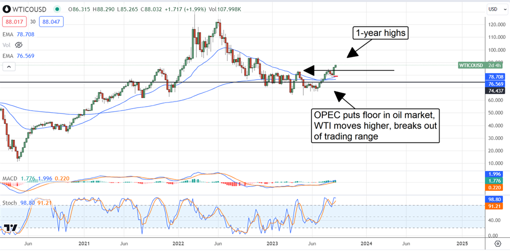
The Risk to Inflation and the Fed is Oil
The risk to the inflation outlook is oil (NYSEARCA: USO). Oil prices are closely tied to inflation and underpinned the rapid pace of inflation in 2021 and 2022 and subsequent cooling in 2023. The oil price is moving higher and recently broke out of its 1-year trading range to set a new high. That high has the airlines cautioning investors to lower their expectations, and the truckers will be next.
Rising oil prices mean rising energy costs throughout the economic system and another acceleration of inflation. The CPI is due next week and maybe tepid, but it won’t stay tepid for long, with WTI on the rise. Again, the soft-landing scenario suggests inflation will persist. In that scenario, oil demand will be steady or pick up, and OPEC keeps supply tight. That will keep oil prices rising and the FOMC on the interest rate trigger.
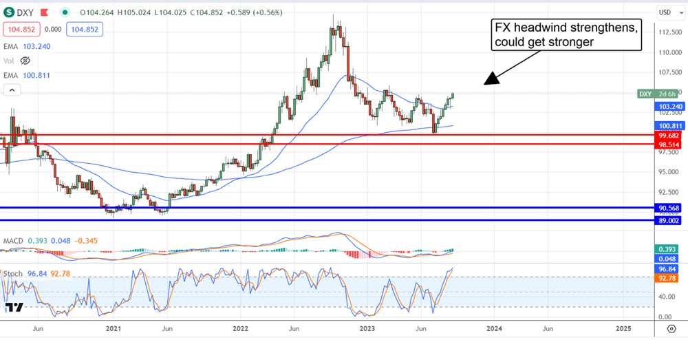
The FX Headwind: It’s Back
The inflation outlook and, more importantly, the central bank outlook have the dollar rising. This is after a year of cooling and stabilization at the highest levels in 2 decades. The takeaway is that FX conversion will come back into play as a headwind for the S&P 500 and just as it started to disappear.
This is good news for emerging markets whose central banks are ahead of the curve. They are expected to begin cutting rates soon, accelerating the dollar rise.
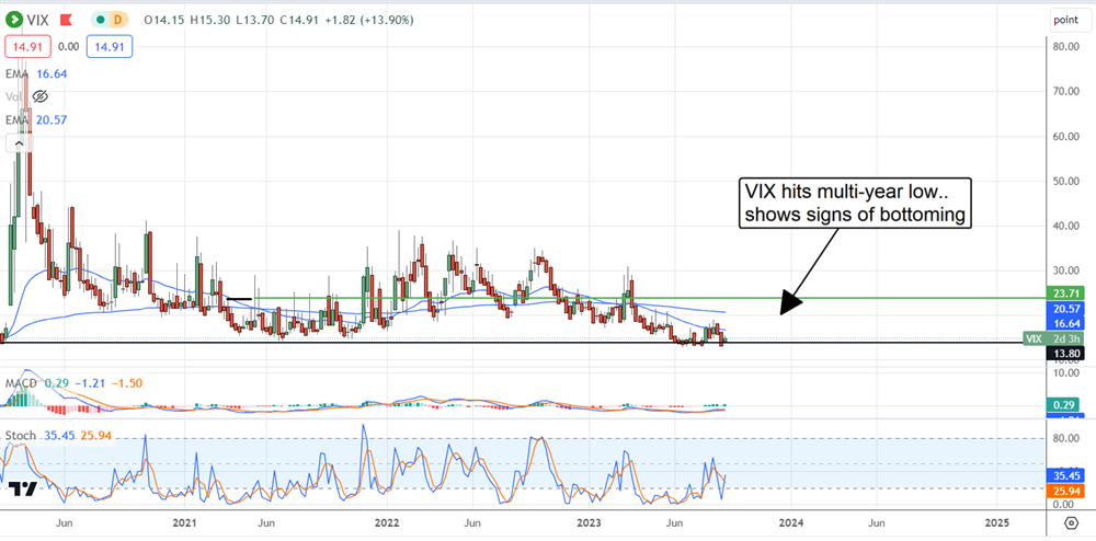
The VIX Says Equity Traders Are Too Complacent
The VIX (BATS: VIXM) is the market’s volatility and fear meter, which says fear is low. The lowest it's been since the spring of 2020, which is saying something. At that time, fear percolated near long-term lows and indicated an impending market rally. The same could be true now, but there is risk.
The market is still adjusting to the “New Normal” and has rallied to unsustainable levels on bad-news-is-good-news events. Inflation cooled, but it is not cool, and economic risks are present. The worst-case scenario is that a catalyst emerges that triggers a spike in fear. In that scenario, a move back to the 30 region is possible, and a double-digit drop in the S&P 500 will accompany it.
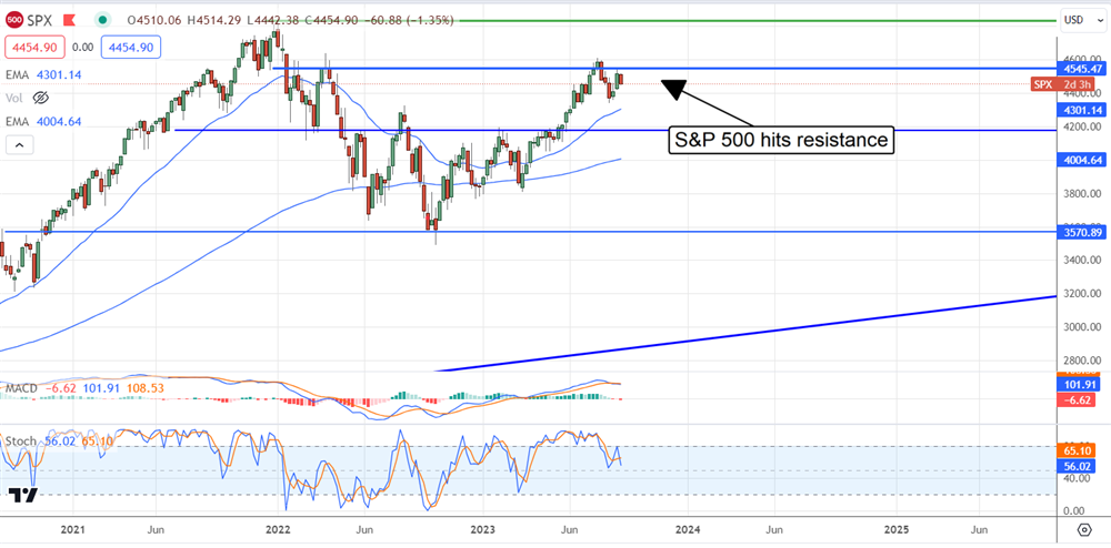
The S&P 500: At Resistance With Catalysts In Sight
The S&P 500 (NASDAQ: SPY) rallied strongly all year and has reached unsustainable levels without positive news to drive it. Those levels mark a resistance zone that includes the all-time high and may provide solid resistance to price action. The action has already retreated from the zone once and is now showing a peak at a lower level with weak indicators. The MACD turned bearish with the last correction, and the stochastic weakened significantly.
At the current level, MACD signals a severe weakness within the market. Catalysts that could trigger the next move include the CPI report next week, the FOMC meeting in 2 weeks, and the start of the Q3 earnings reporting season. If the market can not sustain the rally and move to a new high, it will remain range-bound with a chance of testing support levels near 4,200 or lower before the end of the year.